You’re Looking, But Can You See?

If there’s one thing that’s become clear to me is that everything you create is intentional and carries meaning. In my first post, I wrote that I didn’t believe myself to be a creative person. However, through the creation of my own works, I see that this is not the case. There’s always something to convey, there’s always been a reason behind everything I’ve made. The first step for me was understanding the different design elements and learning how they work together. Being able to understand this and having the vocabulary to articulate it allowed me to consider each element when searching for an image that represented my qualities (my Metaphorical Me). I was also able to use these skills to find those elements in my surroundings. Lines, shapes, shadows, patterns and textures exist all around me, what I was missing was perspective. When tasked with looking, it was surprisingly easy finding and capturing these elements in my tiny apartment (see image below).


Of course, that’s only one side of the coin. The other side is how your work is perceived, which is something that is just as important, especially if you want to make sure your intended message comes across. For example, the image below is the one I took for my carte de visite. By itself, it doesn’t say much. Anyone who sees this image would probably ask why I’m trying to hold up the Greenway Trail sign. However, I changed and added some elements in order to change the meaning of the image. I arranged the items to be cluttered and competing against each other, but it came across as “contained and settled”. 1This gave me pause and I reconsidered how I could’ve arranged them differently, and how this particular arrangement changed the meaning of the image entirely. I wanted to convey how it felt to have to balance so many roles at once. In the end it was a perfect representation of my life: contained on the outside but spiraling internally. 

This is why it’s important to consider how others will view what you create. Visual thinking allows us to use images and representations to convey messages and ideas. As is stated in Practices of Looking, “a single image can serve many purposes, appear in an array of contexts, and mean different things to different people” (Sturken and Cartwright 13). What we see is not only dependent on the physical image and composition, but also the cultural context and our own personal experience. Returning to my carte de visite, I relied on the connotations of my objects to convey my message. However, depending on people’s own relationships with their parents, siblings, coworkers, and spouses, their reactions will vary widely. However, I still implemented color, shape, space, proximity, balance, and many other elements of design in order to convey the weight of carrying so many responsibilities. 

The Eldest Daughter © Iris Bailon, CC BY-NC-ND 4.0 DEED

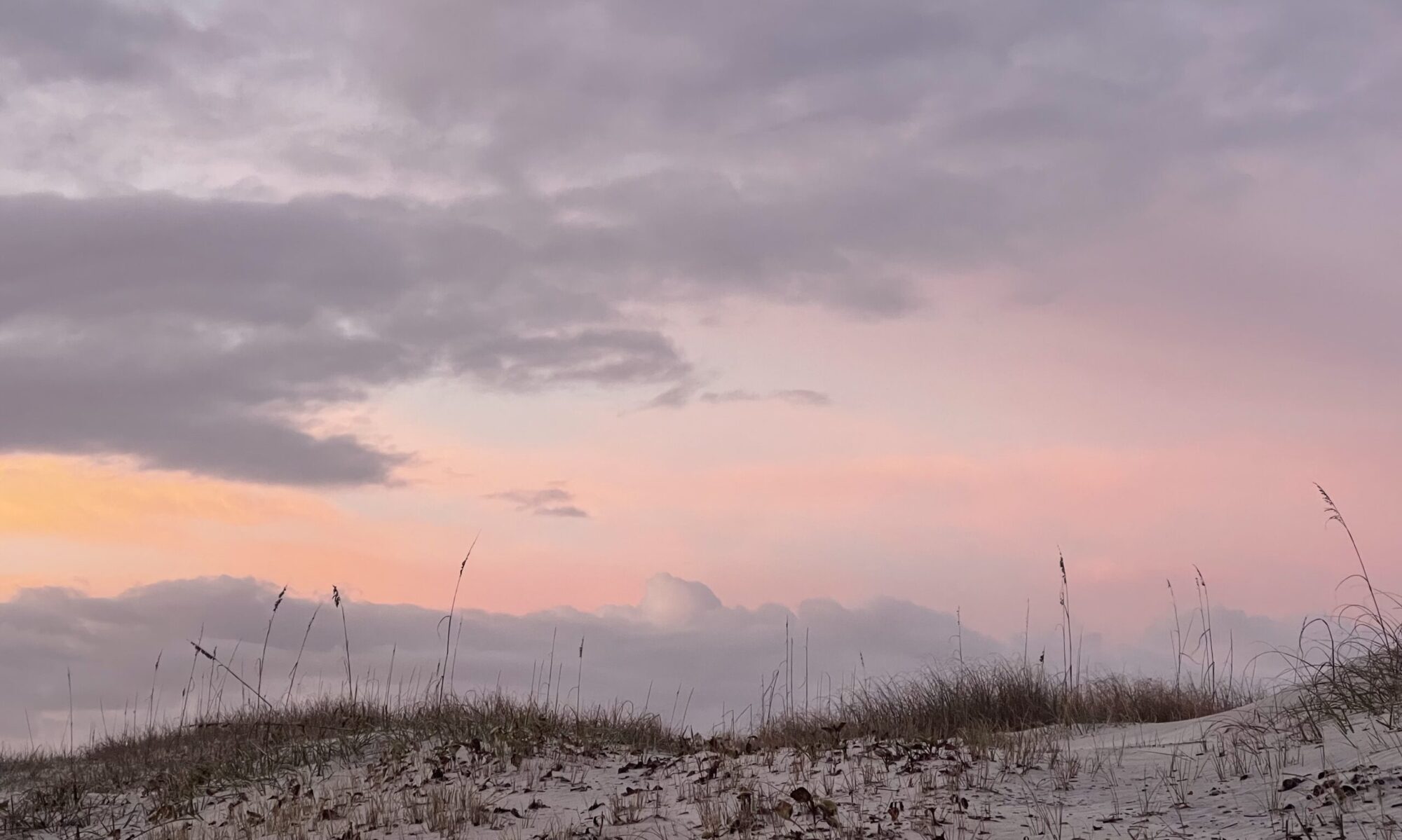
Looking extends not only to works of art but to all forms of media consumption, including websites. For my website, I created a platform that encapsulates my personality and interests. Maybe it’s because I live a cluttered life, but I wanted the website to feel peaceful and inviting through the use of space and color. As soon as you enter the website, you see an image of a sunrise in Cumberland Island, an island that has been largely untouched by humans. In this space I created, you can find my process posts as well as all my other hobbies and musings. As of now, the purpose of the website is a reflective venue and a place to showcase my work, interests, and advocacy. My photographs offer a personal touch and a sense of authenticity. I don’t want to hide; on my advocacy page I detail my struggles as an undocumented immigrant. Of course, even this is carefully curated. I currently have 23,822 photos in my camera roll on my iPhone. I am picking and choosing to post only a fraction of everything I have captured. It is through the use of these photographs that I will continue to communicate visually to my audience as I further develop my page.

Ultimately, visual communication stems from being able to hone the art of looking at something and being able to discern the meaning through the elements it’s composed of and the context it exists in. With this in mind, I hope to continue thinking deeply about how I use visual media to communicate.

References:

Sturken, Marita, and Lisa Cartwright. “Images, Power, and Politics.” Practices of Looking: An Introduction to Visual Culture, 3rd ed., Oxford University Press, 2017, pp. 13. 

  1. See Professor Ruby’s comment on “Photoshop OR: The Return to My Fangirl Years” https://docs.google.com/document/d/1fj5RphUMAsEieKJKC9hK3vmsaQgApIPrCa9sN0C-vWg/edit?usp=sharing ↩︎

My Plan For This Website Moving Forward

Photoshop OR: The Return to My Fangirl Years

When I was in high school, I was a huge fangirl, and by that I mean I was obsessed with pop culture phenomena like One Direction, Doctor Who, Sherlock, Vampire Diaries, you name it. I had a twitter fan account for One Direction and a Tumblr fan account for all my favorite T.V. shows. One of the skills that I developed as a result of this mania was a familiarity with Adobe Photoshop, which I used to create edits that I shared on Tumblr. Truthfully, I never became very good at it, but as I tinkered with Photoshop in this course I saw that these skills would’ve been super handy in high school. Maybe my obsession would’ve developed into something more productive.

Working with the software this time required more of a learning curve than I had expected. While I was familiar with some of the tools, it was like learning how to use it all over again. I had to watch and rewatch the tutorial on how to do a cut and paste over and over until I finally got it. (The layers shown in the video were really throwing me off).   Using the Magic Wand tool, I was able to take cutouts of other images and make a collage of sorts. To be completely honest, I found no magic in the magic wand tool. No matter how much I adjusted the sensitivity, I had a hard time using it to make the selection I was after. Because it’s pixel based rather than line based, Photoshop is considered a raster software. Because I’m a perfectionist to a fault, I ended up zooming way in to enable me to manipulate the work pixel by exact pixel. This was time consuming, so I hope that I can find an easier way to work with it. For some more complicated shapes, I   used the magnetic lasso tool, which helped tremendously.

The default action for Photoshop is to create a new layer for each item that you paste, resulting in a new layer for each component I added in Jacob Lawrence’s image. Fortunately, that doesn’t change the image; I am able to get rid of it if I change my mind by simply unchecking it. It also allows me to make changes to a specific layer without affecting the whole image. For example, in my carte de visite, I was able to make the background black and white while maintaining the color of my objects. I could also add a completely different filter to every layer. This is a major  benefit of using Photoshop instead of  hand-drawn art. If  you make a move you don’t like, you can undo it with a click of a button and create something else. 

For Jacob Lawrence’s Munich Olympics Poster, I   replaced existing shapes with images I’ve made of flowers. The flower trend started in the winter of 2023, when I took up the habit of keeping a bouquet of  fresh flowers on our kitchen counter, which  I am constantly photographing. I keep flowers to boost my mental health. I used  four of my favorite arrangements in this collage, which provided a wide arrangement of colors and textures to choose from. Although I matched the colors in  the shapes of the original image with flowers of similar hue and value, the texture and particularity of the flowers transformed the image bodies, while I kept the original shapes and faces. I played with textures, to clearly delineate some rose spirals. In other components, you can make out petals and leaves. The skin tone of the runners was something I intentionally did not change, so I worked with dark red/burgundy floral hues  to keep them true to their original color. While working on this piece, I made sure to save it as a .psd to  preserve the layers in case I wanted to make changes.


For my carte de visite, I followed the theme I had devised as  “Metaphorical Me.”  I show myself holding up items that symbolize important aspects of my life. The gummy bear is symbolic of my relationship with my younger sisters. We’re very different people, but we share similar values and experiences, and gummy bear hand sanitizer is a fun way to express these relational bonds.  As the oldest, I am  deeply protective of my sisters, having grown up in the role of their second mom. My relationship with them is something I value deeply, but requires me to balance it alongside other responsibilities. An image of myself on my wedding day standing between my parents represents my responsibility as the oldest daughter in a family of immigrants to be available to the family and set an example for my siblings.  A small note my coworkers wrote for me–the department administrator– on Administrative Professionals Day again shows me in a support role, a recurring theme in my life. Finally, my wedding ring, which symbolizes my role as a wife. The ring is not to scale because it plays a huge role in my life.

In terms of composition, I set a serious tone; I look away from the viewer and do not make a connection. I set myself and the background in black and white to draw the attention forward. I have the items balancing on top of my childhood album, a significant item to me since it contains all my memories of growing up in Mexico.The items are out of  scale; I needed to make them feel like they were cluttered together and competing against each other. Ultimately, they balance themselves. I include my favorite plant, the albo monstera that I’ve nurtured from a two leaf cutting. Disproportionately large in scale, the plant’s leaves duplicate one another and stretch out on either side of me as they mirror my height. Although we don’t touch, the green plants accompany me and help bear my load.

Process Post 1

Worries: not artistic, I personally don’t believe I am a creative person/don’t know how to think outside of the box.

To me, analyzing art unearthed the same trauma as having to write an essay on a DBQ in AP History. Despite my initial concerns, I was surprised by how deeply I considered each assignment and how carefully I contemplated each image. Going into the Metaphorical Me project, I wasn’t thinking much about the elements but rather just what felt “right” to me. After a lengthy google search, this is ultimately the image I chose to represent me:

Now I have the vocabulary to articulate that I was drawn by the repetition and texture of the aloe vera tendrils and the contrast between the dark, damp soil and the bright green aloe plant. While formal elements are the components that make up an image, they are also what leads to finding and describing meaning.  In this case, this image inspired thoughts of dirty vs. clean, decomposing vs. healing, gritty vs. smooth. There is such a contrast between the brown of the soil and the green of the aloe vera, both in how they look and what they represent. The dirt helps to elevate the aloe vera’s healing properties, with the vibrant green of the leaves symbolizing life. The fact that the leaves are not contained within the borders opens up the possibility of the tendrils continuing to reach towards the sky.  All these elements (lines, texture, shape, color) come together to convey a narrative. Going through my group’s adjectives and chosen images, I was blown away by how their images captured their essence so perfectly. After some suggestions from my group, I chose the following as my final image:


This image also tells a story: harmony, collaboration, trust. The bees all form one line, balancing each other out perfectly.  The eye follows the line from one side to the other; in contrast to the plant, this line is moving horizontally instead of vertically. Once I decided on bees, I went through various potential images. These were second and third place, respectively:


All three images have bees but their elements convey different meanings. I almost chose the photograph to the left but decided in favor of the chain of bees. Looking at the photograph of the bee on frost-covered tall grass, I could almost feel my fingers burning from imagining the cold ice. The bee not only seems to be almost frozen along with the grass but it’s also alone, which conveys a feeling of loneliness and isolation. The realism is what elevates this image, as I don’t think the same feeling could be communicated through a watercolor painting. In fact, to me, images of watercoloring paintings of winter scenes have an almost innate feeling of warmth and softness to them. For the watercolor bee, which places emphasis on the flower and the bee, it conveys serenity and simplicity, with the bee and dandelion being the focal point. The lines are relaxed and curved, rather than rigid. The colors are cohesive and peaceful. The bee is at rest and so is the flower and the greenery surrounding it. Ultimately, I decided that choosing this image would be insincere to myself, since I consider myself more rigid than easy-going. 

It was amazing to see how these images evoked such feelings from me, and even more so how I was able to verbalize these feelings using the terminology I learned. Working on finding an image to describe myself and searching for art elements around me were two sides of the same coin; both explored the elements of art and how you could use these to tell a story. I was honored that one of my team members mentioned that this picture I took of my door looked “mysterious and angsty”. Although that might not have been the story I was trying to tell, they were able to find meaning in the shadows and the value. As I was going around my small basement apartment 1, I got my “creative juices flowing” as my high school Chinese teacher used to say, and explored different ways to redefine everyday items. Some seemed a little silly at first but I felt like I was back in my freshman year photography class, thinking about how to capture these elements in the wild. 

As I searched on the web for images that could express the adjectives I’d chosen for myself, all the images I found (except for the water color image) turned out to be stock images, which took me down a rabbit hole of what a “standard license” was. Overall, I discovered that I needed to either purchase these items or create a free trial account in order to be allowed to use them. I definitely do not want to be sued for copyright infringement so I went for the latter. I was curious about what CC images were available so I perused Flickr and there were definitely some images I could’ve used instead. When it came to uploading an image on Flickr, my group chose the picture I took of my Gecko’s terrarium. We decided on the attribution license so that at least I would get some credit if someone decided to use it and called it a day.   

Screenshot of my gallery while doing the treasure hunt.

css.php